There’s a good chance you are already incorporating color in your business dashboards and wallboards. When a problem arises with your contact center software, you might send an alert to your wallboard outlined in red. When your staff reaches their goals, you might highlight their performance metrics in green. Different shades have a unique emotional impact on us as human beings.
Perhaps more importantly, color in wallboard designs can improve the clarity of your communications and make your business more inclusive.
Let’s explore the use of color in wallboard design.
Wallboards and Color Psychology
Color psychology is a popular area of study in all aspects of design. Website builders use color psychology to help improve the usability of their sites and evoke feelings in their target audience. Brands use color to define their values, create a certain emotional response, and separate themselves from the competition.
In your contact center wallboards, color psychology can highlight the nature of a message, metric, or piece of crucial information instantly. For instance:
- Red: When you need to show employees they’re not hitting their targets for things like first call resolution, you might highlight that metric information in red. The color red is ideal for capturing attention and inspiring action. It’s also associated with danger or trouble.
- Yellow: Yellow can be a bright, sunny, happy color, but it can also be a great way to convey priorities. For instance, as part of a traffic light system, red could highlight the most important task for your team, while yellow tasks follow quickly behind in importance. Yellow is also associated with caution or can be used to make you aware of something approaching.
- Green: Green is a highly positive color, associated with wealth and growth. In a contact center, the color green could show a task has been completed or when a target has been met. You can also use green to highlight positive news, like which team won your competition for the quickest call response rate.
- Blue: Blue is a reassuring color, associated with harmony, reliability, and tranquility. You can use this as the central color of your wallboard to make your employees feel at ease. Blue can also be a great shade for business branding because it helps to generate loyalty and trust.
- White: Often associated with modernity and clarity, white is ideal for making your wallboards look crisp and clean. Ensuring there’s plenty of white space between graphs and statistics will prevent your staff from feeling overwhelmed by what they see.
Color and Communication on Contact Center Wallboards
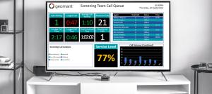
Many contact centers use traffic light systems to indicate progression, or performance in a certain area. At a glance, an employee can look at a row of statistics and see that a red number is bad, a yellow number is worrying, and a green number is satisfactory. This makes it simpler for staff to determine immediately which areas need the most immediate attention.
Color can add emphasis to certain parts of your wallboard, too. Bright and bold colors used to send notifications or alerts to the wallboard will pull your employees’ attention away from their current work and force them to take notice. Color can help with organizing information on a wallboard and bring more structure to the content. For instance, if you have several different graphs, highlighting them in different colors will help to keep the information separate.
Quick Tips for Designing Wallboards with Color
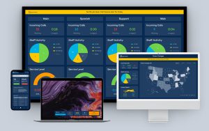
Fortunately for today’s companies investing in wallboard technology, there are a variety of high-quality tools out there offering color customization options. The latest update to the Geomant’s Wallboard and Agent Desktops technology provides plenty of color-rich choices. Here are some quick tips to help you improve your color decisions:
- Include plenty of contrast: Contrast is key to clarity when designing with color. Your words and statistics need to stand out against the background. Avoid using dark backgrounds with dark fonts or light backgrounds with paler typography.
- Use colors that make sense: There’s no need to reinvent the wheel when you’re choosing colors for your wallboards. If most of your employees would already assume that red means “bad” and green means “good,” don’t confuse them by choosing a unique traffic light system. Stick to shades with immediately evident meanings.
- Be cautious with clutter: Be mindful of how many colors are being used on one page so you don’t overwhelm your employees. If you have various shades already on your page being used in graphs or table-based metrics, make the background white and the font black to minimize the amount of visual overwhelm.
- Use color for categorization: Color can be a great way to separate pieces of information on your wallboards or dashboards. For instance, you could use blue graphs to show customer satisfaction ratings and orange graphs to highlight the number of calls your employees are answering per hour.
- Remember your brand colors: Provided they won’t be too confusing combined with other shades, using your brand colors can be a great way to make your wallboards look professional. At the very least, consider adding your brand logo to the top of the page to remind your employees that they are a vital part of the team.
- Check for clarity: After adding colors to your wallboards and dashboards, ask multiple people to check their appearance and comment whether the content is legible and easy to understand. Make sure you examine how your wallboards are going to look on multiple devices, too, such as large screens, employee laptops, and tablets.
Just as you would when introducing any technology to your employees, it’s a good idea to set up a feedback loop after introducing your new wallboards. Allow your staff the opportunity to comment on what they like and dislike about your color choices. This way, you can update your boards over time to make them more engaging for your staff.
Contact Centers: Show your Colors
With the freedom to choose your design and color preferences in the Geomant Contact Center Wallboards, take the time to explore the benefits of things like color psychology, communication, and clarity with your teams. The use of the right colors can impact everything from brand loyalty to employee cognition. Get out there and start experimenting with your shades.


