Screen time has grown consistently over the last decade with displays being incorporated on things now such as doorbells, refrigerators, and watches. Screen time is heavily incorporated into workdays now too of course, especially with the addition of remote work.
So, what’s all this extra tech time doing to your eyesight? Whether checking the wallboard stats on a monitor, looking at your smartphone or swiping through content on a tablet, the health and safety of your employees is not something to be ignored.
Computer Vision Syndrome and the Wallboard
Experts predict increased screen time could be causing a host of issues with our vision, from increased eye strain to dry eye and even a higher chance of migraines. The problem has become so significant it’s creating a condition called “Computer Vision Syndrome.” The American Academy of Ophthalmology has published recommendations on how to handle the influx of eyestrain associated with digital devices.
Today’s business leaders need to balance the wellbeing of team members while providing them with access to the KPIs and metrics they need to maintain their motivation levels and drive better results.
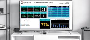
An efficient wallboard solution that provides real-time, beneficial data in an optimized format should ensure you have the best of both worlds – an informed team without any unnecessary eye strain. You can improve your chances of adhering to the guidelines of modern DSE assessments too!
How to Make Your Wallboards More Vision-Friendly
The first step in ensuring your employees have a vision-friendly experience when working is to encourage them to take extra precautions with their home or office setup. It is essential to ask team members to have plenty of access to natural light and avoid glare on their computer screens.
It’s also worth reminding your team members to take breaks regularly! Though it’s tempting to always encourage work from your staff, breaks can protect their eyesight and improve creativity. You can even use wallboard announcements to remind teams to take a break.
When designing your wallboards and agent dashboards, there are a few more design-focused considerations to keep in mind. For instance, you should:
- Know the crucial information: Make sure you know which KPIs are most important to each team member. This will ensure you’re not cluttering the screen with too much information. You can even allow team members to adjust elements of their dashboard, removing any data which might not be crucial.
- Use visuals: It’s easier to absorb information rapidly from a visual than from a piece of text. Icons can offer clear information quickly without taking too much space on a wallboard. Similarly, charts and graphs can make it easier for team members to see important details immediately.
- Experiment with fonts and colors: Fonts and color on a wallboard aren’t just there for branding purposes. They’re also an important factor in how legible your wallboards are. Fonts should be crisp, clean, and easy to read. Consider how clear a particular font might look on different sizes of screen. Colors can add visual interest to a wallboard, but they shouldn’t make the page feel overwhelming. Harsh colors like bright yellow can cause eye fatigue and make it harder for teams to stay focused.
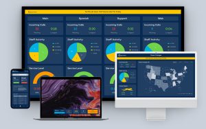
- Choose your layout carefully: A well-organized wallboard or dashboard will group connected pieces of information, so it’s easier for team members to find the data they need. Grids can help you create an effective alignment for your wallboards and dashboards. Don’t forget to include plenty of white space too! White space around various facts and figures improves comprehension and prevents the board from looking cluttered.
- Make your boards “glance friendly”: To reduce the time your team members need to evaluate and assess different parts of your wallboard or dashboard, make sure information is “glance friendly.” Your team members should be able to quickly look at the screen and understand the information in seconds.
Remember, you can always customize different dashboards for various groups or divisions so you can focus on specific KPIs for each of those users. You might also sort various pieces of information onto different pages, so your teams can choose which page they need to focus on based on the task at hand.
Make Your Wallboard Easy on the Eyes
Wallboards and dashboards have a lot of value to offer in any business environment, especially in the age of hybrid work. However, as issues like computer eye strain continue to impact team well-being, it’s crucial to ensure you’re not making matters worse.
Take the time to craft the perfect wallboard or dashboard experience and consider asking your team members for feedback so you can continue to optimize in the months and years ahead.


